What makes a CPR training website actually convert?
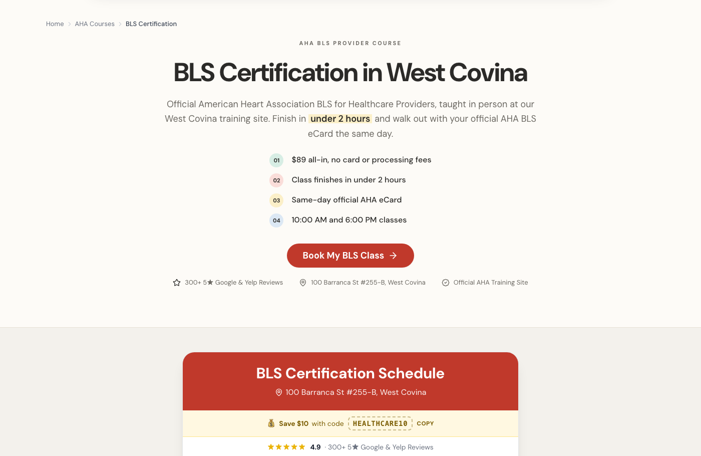
Answering the four questions the visitor came with, above the fold, in the order they think of them. Is this the right certification for what my employer asked for. How long will it take. When is the next class. What does it cost. Every one of those has a specific answer and none of them require a paragraph. Then put the booking calendar on the same page, because a Contact Us button asks someone who was ready to buy to instead start a conversation and wait. Design matters far less than most people believe. A plain page that answers the four questions and lets her book beats a beautiful page that makes her hunt.